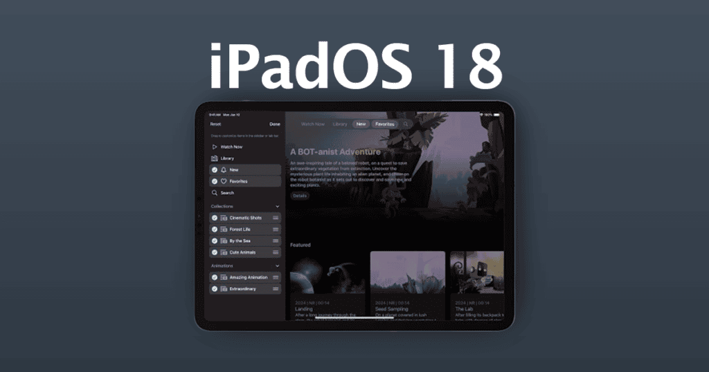
Apple’s upcoming release of iPadOS 18 introduces significant changes to the user interface across several core apps, including Clock, Apple TV, and Apple News. These updates are aimed at streamlining the user experience, simplifying app navigation, and allowing for greater content immersion. Here’s an in-depth exploration of the redesigned tab bars and updated sidebars, and how they contribute to a more efficient and enjoyable iPad experience.
Innovative Redesign of Tab Bars
- Strategic Placement: In portrait orientation, the tab bar has been relocated to the top of the app interface. This change aligns it more closely with other navigation controls, optimizing the interface layout by reducing both horizontal and vertical space usage.
- Focus on Content: This new placement helps minimize distractions from the user interface, allowing users to focus more on the content itself, whether they are watching a show on Apple TV, reading news on Apple News, or setting alarms in the Clock app.
Updated Sidebars for Streamlined Navigation
- Quick Access and Navigation: The redesigned sidebar enhances the way users interact with apps. It provides quick and easy access to top-level destinations, making it simpler to navigate between different sections or features within an app.
- Enhanced Customization: A significant addition is the ability for users to customize their navigation pane. Items from the sidebar can now be dragged and dropped into a pinned section on the tab bar, offering users quicker access to the tools and features they use most often.
Detailed Look at Tab Bar Customization and Functionality
- Customizable Elements: Users have the flexibility to customize which items appear in the tab bar. While certain elements like the Home, TV+, MLS, and Store tabs in the TV app remain fixed, others can be adjusted according to user preference.
- Consistent Access to Key Features: Regardless of customization, essential features such as the search option remain fixed at the end of the pinned section, ensuring they are always within easy reach.
- Adaptation to Device Orientation: It’s also worth noting that the tab bars are designed to disappear when the device is in landscape orientation, providing a cleaner and less cluttered interface during such usage.
Empowering Developers with Greater Control
- Flexibility for Third-Party Apps: With iPadOS 18, third-party developers are given considerable control over how the tab bar and sidebar are implemented within their apps. This freedom allows developers to decide what remains fixed and what can be customized or removed, enabling them to better tailor their applications to fit user preferences and behaviors.
Upcoming Availability and Future Prospects
- Developer and Public Beta Phases: iPadOS 18 is currently available in a beta version for developers, with a public beta expected to launch in July. This phased rollout allows for thorough testing and feedback, ensuring that the final release is polished and responsive to user needs.
- Enhanced User Experience: These interface enhancements in iPadOS 18 are designed to make the iPad more user-friendly and efficient, reflecting Apple’s commitment to continuously improving the user experience through thoughtful design and functional innovation.
The introduction of these redesigned tab bars and updated sidebars in iPadOS 18 marks a significant step forward in enhancing the intuitive nature of the iPad interface. Users can look forward to a more streamlined and personalized interaction with their devices, making everyday tasks on the iPad simpler and more enjoyable.


